
In recent years, graphic design has truly blown up as a great choice for a college degree and profession. Many of us today recognize graphic design as creating spiffy new signs for local stores, crafting a website, and any other thousand possibilities. So, where do we look for those pioneers in the field?
Who is the Most Famous Graphic Designer?
One night, I was combing through pictures and other assorted objects left behind by my late grandfather. Known for being a photographer, I was eagerly looking to find his famous camera and learn more about it.
When I finally found it among the field of pictures and written correspondence, I finally saw my grandfather’s piece of artistic equipment in which he viewed the world.
It was amazing.
Clearly dated, the camera seemed to be an antique store browser’s dream. But more importantly, there was a crisp, nice little logo on it.
It was a blue circle cut through with three lines. I was curious, so I looked it up. It was the Minolta logo from the 1970s and 1980s, designed by Saul Bass.
Maybe you don’t know who Saul Bass is, but I guarantee you have seen countless iconic imagery that he designed. Don’t believe me? Watch this:
- Quaker Oats
- AT&T
- Kleenex
- Dixie
- Girl Scouts of America
- General Foods
- Warner Communications
- Minolta
- Boys & Girls Club of America
This is but a taste of what Saul Bass had done. Those are just logos for internationally recognized brands.
He was also famous for his movie poster work. He worked extensively with the films of Stanley Kubrick, creating appealing, unique posters and film sequences for films such as Psycho, Vertigo, West Side Story, It’s a Mad, Mad, Mad, Mad World, and more.
Saul wanted to bring a different creative edge to opening sequences in movies. Although his designs were unique and could easily stand on their own, he thought that adding movement to the piece of art was crucial and allowed viewers to be ‘primed’ to experience the kind of movie they were watching.
What resulted was a great, creative vibe before these iconic works of films. Check out the opening to The Man with the Golden Arm from 1955 to see what I mean.
How Do Graphic Designers Become Famous?
Of course, not just anyone can propel themselves to Saul Bass’s level overnight. His work represented years of hard work and great networking and connections. But the real question is how you become a famous graphic designer.
So maybe fame isn’t your thing, understandable. But I am talking more about just being a well-known enough artist to keep clients glued to your work.
Talk to people
Putting yourself out there is a great way to signal clients, and the designing world, that you are available, and you are the perfect candidate for the job. Honing interview skills, working on a portfolio of work, and reaching out to people all help the graphic artist become more of a household name.
This includes networking and rubbing shoulders with some seriously big-time clients.
Get featured
Pitch yourself to publications dealing with graphic design. You will need a great story to tell or great pieces to show, so prepare yourself.
Have a Good Website
People love great design and user interface, so to be truly successful, you need to give visitors a taste of what your creative skills can manifest as. Outline mission statements, display work, and more to better advertise your skills.
Who is the Richest Graphic Designer?
It’s not so clear-cut, as designers and their designs vary greatly. We could compare net worths, this is not based on the graphic designer’s salary and artwork and could apply to their personal property like homes and cars.
However, If we were to forego this and examine net worths anyway, designers like Chipp Kidd and Michael Bierut have impressive net worths of $16 million and $1.4 million, respectively.
50 Most Famous Graphic Designers & Artists
Saul Bass
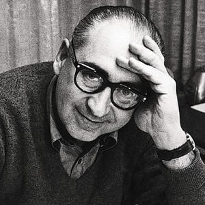
I have already gone into the many different ways that Saul Bass has changed the design world through his illustrious career, but I believe his impact should always be acknowledged. He changed movie titles from being stationary, boring aspects that simply displayed actor names to a living piece of the movie, drawing the viewer in.
Chip Kidd

You may know Kidd’s work through the wildly famous design for Jurassic Park. Kidd originally designed the book’s cover, and it transferred to movie posters in 1993.
He has created book jackets for numerous books and famous authors. His work includes book designs for James Ellroy, Haruki Murakami, Alan Moore, David Sedaris, and Bret Easton Ellis among others.
He gives talks and contributes to famous magazines like The New Yorker.
Rob Janoff

Janoff is the creator of the iconic Apple logo used by the company from its inception in the late 1970s. No matter what, the company has kept a simple yet effective design.
The decision to include a bite out of the apple was what sealed the deal in Janoff’s mind: it gave its personality. He also was inspired by psychedelic and hippie aspects to design the Apple II logo.
Michael Bierut

Michael Bierut is an award-winning designer who has been a partner at Pentagram since the early 1990s. His work can be seen in the Museum of Modern Art (MoMA), Library of Congress, and the Smithsonian Design Museum.
He designed Hillary Clinton’s campaign logo, which includes an ‘H’ with an arrow pointing forward.
Paul Rand
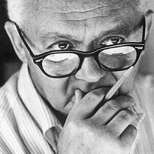
Rand is the man who famously designed the corporate logos for companies like ABC, IBM, UPS, and more.
He was a proponent of the modernist ‘Swiss-style’, which developed in the 1950s in Germany, Switzerland, and Russia. Swiss-style and Rand’s impact on the design world can be felt today. He served as a professor of graphic design at Yale for several years.
Carolyn Davidson

Take a walk for 5 minutes anywhere and you will see Carolyn Davidson’s work all around you. She is the designer of the unbelievably iconic Nike Swoosh logo, designed in the early 1970s after Blue Ribbon Sports changed its name to Nike.
The Swoosh itself has a staggering worth of $26 billion by itself.
Lindon Leader
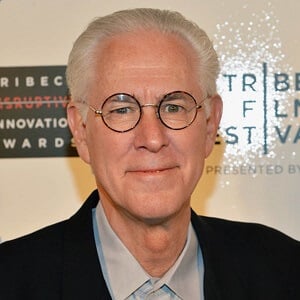
Leader is the respected graphic designer who came up with FedEx’s famous logo, namely integrating the subtle arrow in between the ‘E’ and ‘X’.
Didn’t catch that arrow until I said that? That’s the genius of Lindon Leader’s design.
Along with FedEx, Leader has been involved with the designs of DoubleTree Hotels, CIGNA, and consulted on the Los Angeles Olympic Organizing Committee.
Max Miedinger
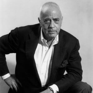
Miedinger is the creator of the all-encompassing font, Helvetica. Created in 1957 as Neue Haas Grotesk, Helvetica has become the font of choice for a huge number of different big brands.
Helvetica has been a staple of Apple’s design process for years, namely from the advent of the iPhone in 2007.
Susan Kare

Susan is the designer of many of the icons made famous by Mac computers back in the day. She worked extensively with Steve Jobs throughout the 1980s regarding design and made famous icons for macOS in the process.
Susan Kaye is a pioneer behind the font Geneva, an essentially reworked version of Helvetica.
Milton Glaser

Much to the dismay of many native New Yorkers, Milton Glaser’s powerful design of the ‘I ❤ NY’ has been an attractive design for out of towners and design lovers alike. It was designed in the late 1970s to promote tourism in New York City, which was going through a hard time financially.
He has also worked at DC Comics.
Peter Saville

Mr. Saville is a great designer responsible for iconic album covers, namely those of Joy Division’s ‘Unknown Pleasures’ and New Order’s ‘Power, Corruption & Lies’. The latter is a beautifully bleak still like different flowers.
He also designed the home shirt for the English football team in 2010.
Massimo Vignelli

“If you can design one thing, you can design everything,” was the message that Vignelli conveyed.
He had a famous piece of work, the New York City subway map in 1972. It drew upon modernist traditions of design and quickly became a staple of the artistic movement.
Along with the map, he worked on the design, (interior, environmental, corporate, furniture), throughout his entire career, which spanned nearly 60 years.
Ivan Chermayeff
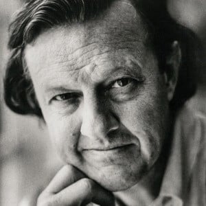
Ivan Chermayeff was a founder of the design firm, Chermayeff & Geismar & Haviv, which designed many iconic designs throughout the years.
The logos for PBS, the Smithsonian, Showtime, National Geographic, NBC, and Mobil are just a few pieces of their everlasting work.
Jim Tierney
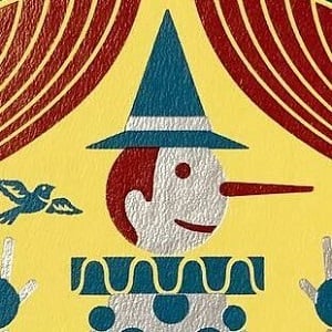
Tierney is a book cover artist, more recently known for his pristine work with redesigning the series of Dune books written by Frank Herbert.
His portfolio also consists of many redesigns and updates of books by Stephen King, Ursula K. LeGuin, T.C. Boyle, and some classics of literature. His newest work, an omnibus of Stephen King’s first novels: Carrie, ‘Salem’s Lot, and The Shining. It is a Barnes & Noble exclusive.
Paula Scher

The first female principal at the illustrious Pentagram based out of New York, Paula Scher has been educating and designer since the early 1970s.
She was instrumental in redesigning many aspects of the Museum of Modern Art (MoMa). Along with this famous New York institution, she had a hand in redesigning aspects of the Metropolitan Opera, and the Windows 8 logo, which she transformed from a flag to an actual window.
Jessica Walsh

Founder of Sagmeister & Walsh, Jessica Walsh has made her bones in graphic design through creative projects like 40 Days of Dating, 12 Kinds of Kindness, and Ladies Wine and Design. She teaches at the School of Visual Arts (SVA), in New York City.
Alan Fletcher
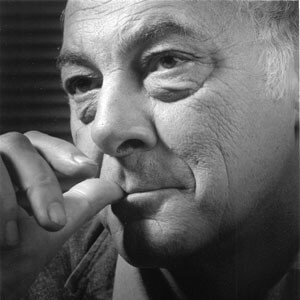
British designer Alan Fletcher was a famous designer who worked closely with Pentagram.
He created the V&A logo for the Victoria & Albert Museum in England, and the IoD logo for the Institute of Directors.
He was described by The Daily Telegraph as “the most highly regarded graphic designer of his generation, and probably one of the most prolific”.
Dana Tanamachi

Dana Tanamachi is a skilled artist dealing mainly with book design, redesigning covers for iconic works of literature like The Wizard of Oz, Peter Pan, and Pippi Longstockings.
She specializes in typography and is extremely dedicated to detail, as exhibited by her excellent hardcover book art.
Alex Center

The lead designer at Coca-Cola, Alex Center led the ad campaigns for Vitamin Water, Smartwater, and Powerade.
He is the founder of CENTER, a Brooklyn-based design firm. “In 2011, Alex was named one of the 200 Best Packaging Designers by Luerzers Archive.”
Shepard Fairey

Anyone who went through the 2008 election saw the iconic piece by Shepard Fairey.
He is responsible for creating the stunning portrait of Barack Obama, with ‘HOPE’ at the bottom. This image became a rallying point for supporters of Obama in 2008 and played a big role in propelling the image of the soon-to-be president.
He also developed the ‘Andre the Giant has a posse’/OBEY sticker campaign, which has since evolved into a huge clothing brand.
Jonathan Barnbrook

This one is near and dear to my heart. Jonathan Barnbrook was the designer of David Bowie’s albums, namely Heathen, The Next Day, and Blackstar.
He also developed the font ‘Exocet’ in the early 1990s, which found extreme fame in the 1996 horror/action-adventure game, Diablo.
George Lois
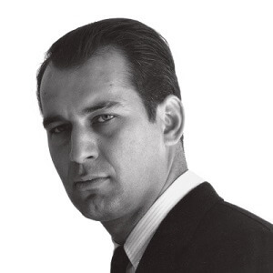
Lois is a design icon, finding most of his success at Esquire magazine in the United States.
In 1968, he designed a lasting, controversial image of Muhammad Ali, hands tied and shot through with multiple arrows, titled “The Passion of Muhammad Ali”. This image combines strong aspects of race and religion, evoking the famous painting of the Christian martyr, St. Sebastian.
Bradbury Thompson
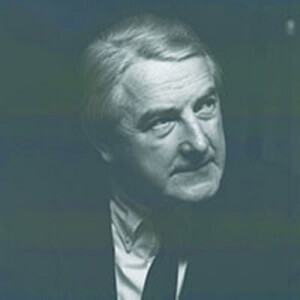
Bradbury Thompson was a design great who was known primarily for his excellent and groundbreaking work in magazines. His imagery is both surrealist, pop, traditional, and postmodern all at once. He emphasized to designers to experiment with everything.
It is clear that he himself experimented with nearly every piece of work he completed. He was tapped to edit the then newer version of the King James Bible using the typeface Sabon. His formatting broke with the traditional printing of the Bible and proved that experimenting can change the world.
Herb Lubalin

Herb Lubalin was a famous typographer who was instrumental in the creation of the Avant-Garde family of fonts, ITC Avant-Garde.
Erik Spiekermann

German designer Erik Spiekermann is known primarily for the development of the famous font, FF Meta, which was adopted by the German Postal Service, Deutsche Bundespost.
He also helped develop the typeface used with Nokia, Nokia Sans, and Fira Sans for Mozilla Firefox.
He has won multiple awards, including the European Design Awards Hall of Fame and a Lifetime achievement award from German Design Prize
Stefan Sagmeister

Working alongside Jessica Walsh, Stefan Sagmeister revitalized an already accomplished career. His work with artists like Lou Reed for his album ‘Set the Twilight Reeling’, and the Rolling Stones for their 1997 album ‘Bridges to Babylon’ made Sagmeister a highly sought out artist for musicians.
David Carson

Carson made himself a household name by being involved with the magazine ‘Ray Gun’, as an art director.
He solidified his grungy, subversive art style by coding an entire interview with Roxy Music’s Bryan Ferry in ‘Dingbats’, a font completely comprised of just symbols. He stresses that he didn’t learn what he does in school, that he simply did what he wanted to, which ended up helping him immensely.
Neville Brody

Brody was the art director for the English newspaper, The Face from the early to mid-1980s.
Along with this, he created album covers for musicians like Depeche Mode and has a permanent display in the MoMA. His stylish and punk-inspired work is truly something to behold and grabs the viewer right away.
Kate Moross

Known for not getting ideas from existing artists, Studio Moross art director Kate Moross gets more inspiration for her work through everyday encounters with normal people.
She has been involved with designs for One Direction, namely their touring artwork and live shows. Things like these have made her a hot commodity in British design circles.
Alan Aldridge
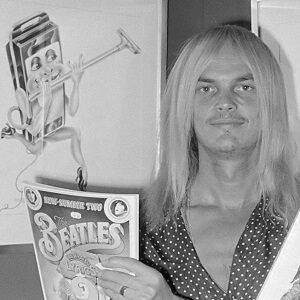
Known for things like the rock band The Who’s second album, A Quick One, Alan Aldridge was a contributor to The Sunday Times Magazine, as well as working freelance for Penguin Publishing.
Those looking at A Quick One notices Aldridge’s iconic cartoonish, flowery style that was a breath of fresh air for the British rock band.
Alexey Brodovitch
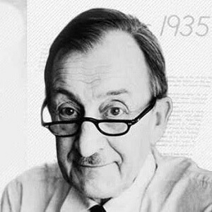
Brodovitch was a lead art director for Harper’s Bazaar magazine from 1934 to 1958.
He was the founder of his art studio, L’Atelier A.B., which he would complete pieces of art for clients like ads and book illustrations. He dabbled in creating pretty much everything: jewelry, textiles, posters, illustrations, china, and various art designs.
Hans Hulsbosch

Australian Hans Hulsbosch is responsible for countless designs for some of Australia’s biggest brands on the market.
He designed Qantas Airways iconic kangaroo logo; aptly named ‘the flying kangaroo’. He is also responsible for working with companies to design packagings like Kleenex, Huggies, and Windex.
His company, HULSBOSCH, has garnered an impressive amount of rewards for their past and present work with companies like Volvo, Woolworth’s, and Royal Caribbean.
Jan Tschichold
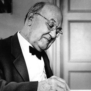
Tschichold is responsible for creating definitive texts on typefaces and art design through his books, (Die Neue Typographie), which quickly became the industry standard for years to come.
During middle age, he would go on to redesign 500 different covers for books for Penguin Publishing.
Jon Burgerman

New York City-based artist Jon Burgerman has had a hand in designs for Nike, MTV, Pepsi, and a slew of other household name brands.
Considered a ‘doodle artist’, his cartoonish style has been featured in documentaries, murals, even culminating in his formation of a pop-art band, Anxieteam.
Josef Müller-Brockmann
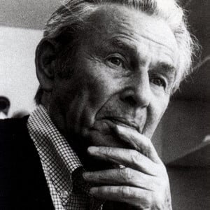
A powerhouse for minimalist design, Josef Müller-Brockmann was the author and designer of multiple definitive texts on graphic design.
He was hell-bent on ‘radical minimalism’; trying to organize things as best as possible in coordination with his designs. His emphasis on clean and crisp typefaces and geometry still holds up today as sleek and attractive designs, despite being nearly 50 to 60 years old.
Eric Carle

Anyone familiar with children’s books is no stranger to the designs of Eric Carle.
Carle was the writer and author of The Very Hungry Caterpillar, which popularity earned it many top spots on the top children’s books of all-time lists. It has been used to promote healthy diets, has been endorsed by former first lady Barbara Bush for her literacy initiative, and has been translated into 40 different languages.
Dick Bruna

Dick Bruna is a famous Dutch designer who is responsible for designing the cutesy little rabbit, Miffy. Miffy has been featured in countless picture books authored by Bruna.
Along with Miffy, Bruna has designed over 2000 covers. Although he specialized in children’s literature, he was no stranger to mainstream movie designs like The Saint and James Bond.
Leif Podhajsky

With famous clients like Virgin Records, Leif Podhajsky has become a famous designer of album covers for different bands.
He is responsible for working with famous psychedelic band Tame Impala on their two albums Innerspeaker and Lonerism, both exhibiting trippy photographs that telegraph exactly what the band is all about.
Otl Aicher
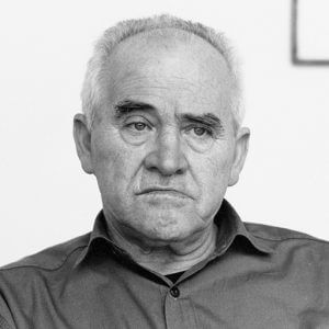
One of the cofounders of the Ulm School of Design in Germany, Otl Aicher was instrumental in creating the 1972 Summer Olympics poster for Munich.
Showcases a more minimalist design, the poster uses a simple typeface and attractive blue color scheme for the Olympic rings. It may have been designed in 1972, but it could easily pass for the next summer Olympics.
A fan of branding, he designed the Lufthansa logo in the late 1960s.
Masaru Katsumi
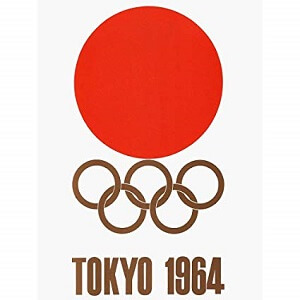
An influence of Otl Aicher, Katsumi designed in the 1964 Olympic poster featured for the Tokyo Games, which I believe may still be the best design for the Olympics. It is simple and represents Japan beautifully by having the golden Olympic rings rest below a massive red sun, echoing Japan’s national flag.
Along with the poster, he created simple yet effective icons to represent the different sports at the Olympics. He also was an art critic.
Margaret Calvert

Take a drive any day of the week in the United Kingdom and you will come face to face with the work of Magaret Calvert at least a dozen times.
She collaborated with fellow artist Jock Kinneir to many road signs. Not limited to only road signs, she also was instrumental in developing signs for air travel and railways.
Storm Thorgerson

Any fan of music will most likely recognize the great work of Storm Thorgerson.
He designed the amazing cover for Pink Floyd’s The Dark Side of the Moon, featuring a black background and a prism with light passing through it. He worked steadily on Pink Floyd album covers from the 1960s until 2011.
Along with Pink Floyd, he has worked extensively with a large number of musical artists. Led Zeppelin, AC/DC, Genesis, and Queen were just some of his famous clients.
Tibor Kalman

Tibor Kalman started his rise to fame by being the lead designer for what would become the famous bookstore chain Barnes & Noble.
He would then go on to be the editor-in-chief of Colors magazine. The magazine used vibrant images and attractive typeface to push its message of multiculturalism. In a famous example of the magazine’s work, Queen Elizabeth II and the Pope were shown as minorities.
John Alvin
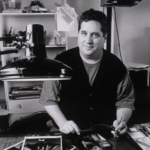
Movie fans will instantly recognize the work of John Alvin.
He created the artwork used in Blade Runner, The Lion King, The Emperor’s New Groove, and Star Wars.
His great photorealistic drawing skills added an epic element to his movie posters. Contemporaries posit that his stunning work propelled popularity for the various films.
Vincent Connare

Perhaps best known for his creation of the Comic Sans and Trebuchet fonts, Vincent Connare has made system fonts for both HP and Microsoft.
He created the Ministry of Sound logo and launched Magpie OpenType, which combines different font and typeface influences.
Wim Crouwel

Typeface and font designer Wim Crouwel originally served as the general secretary of the International Council of Graphic Design Associations.
His interest in International Style allowed him to work on things like Dutch stamps, the New Alphabet font and has had his work shown internationally.
Stanley Donwood

Fans of the alternative rock band will know Stanley Donwood’s work. The album ‘Kid A’, and ‘Amnesiac’, which he won a Grammy for.
His emphasis on screen printing is reminiscent of Jean-Michel Basquiat and Andy Warhol, highlighting sometimes messy and simplistic design.
Wolfgang Weingart

Known for his new wave style, Weingart style was considered ‘punk’ for its subversion of clean and stark minimalism. He was an influence on students he taught, culminating in the ‘Weingart Style’.
His work is often somewhat chaotic, using many greys and blacks, yet also evoking art deco styles of years gone by.
Adrian Frutiger
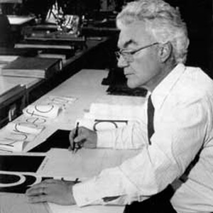
Frutiger was considered responsible for taking typography from basic typeface to digital typeface. He developed typefaces Président, Ondine, and Méridien in the 1950s. With his leap into a digital typeface, he had a hand in rewriting the signage for the French metro.
April Greiman

Drawing on influences like Wolfgang Weingart, April Greiman was responsible for introducing the new wave design style to America.
She emphasized glitches in digitization and added it to her art while others were more hesitant to switch to digitized design. Her work looks like if Wolfgang Weingart was cranking out acid-laced, crazy, colorful, pop stuff in the 1980s and 1990s.
