What’s not to love about a good video game cover? You get a general idea of the game: its theme, characters, and mood. Like movies, games have become a staple of our pop culture, and sometimes video game cover art is more famous (or infamous) than some of its media counterparts.
One thing I hated to see while browsing was used games at the games store, seeing the generic store cover with which they replaced the actual art.
Part of the fun of being a gamer is to own all of this great art. From the first generation of games to the current and eighth generation, video game art has been an integral part of video gaming.
Video Game Cover Art: Then and Now
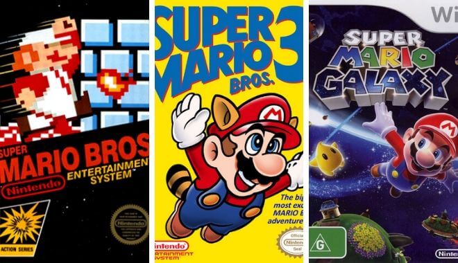
Video game cover art has existed since the first games were sold on the market. Pac Man, Space Invaders, even E.T. the Extraterrestrial, had iconic and memorable video game cover art.
The size of the cartridges in which games were sold grew larger, and seeing the business opportunity, many game distributors started selling games in larger boxes for better recognition.
Take a look at any gamer’s collection, and you will see rows of great modern gaming art. What makes it so great and recognizable? Well, there are some hidden psychological strategies behind some of your favorite video game cover art.
The Contrast Effect and Color Schemes
In psychology, the contrast effect is:
To parse through the jargon, think about seeing a cheaply priced item right next to a costly one. Thanks to the contrast effect, the cheaper product now seems like an insanely good deal. This also goes more simply for art choices.
Color schemes tie into this as well. There has been a prevalent practice of contrasting two different colors, blue and orange. These pop up everywhere, and I mean everywhere.
Favorite movies? Check.
Favorite games? Check.
Targeted advertisements? You guessed it; it’s there too.
This color scheme is more natural and more pleasing to our eyes; thus, the aim is to target better and design these pieces of visual media.
Video Game Cover Art Trends (and Clichés)
Seeing a game character as a silhouette on a stark white background can be seen as being very memorable. Why do you think so many video game covers have utilized this?
Character Facing the Front
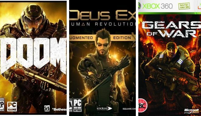
Remember that one game where the protagonist is displayed on the cover, facing you head-on? They look like they’re making a strong pose. Oh wait, that’s right: it’s a hefty amount of cover art.
The Assassin’s Creed, Battlefield, and Call of Duty franchises are notorious for this. Recently, with games like Bloodborne and Dark Souls, the character is facing AWAY from the front.
Back Facing
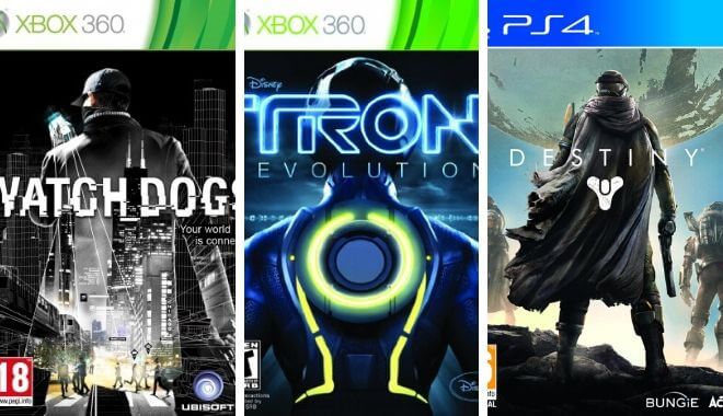
Not much difference to this one. Like characters facing the front of the camera, these pieces of video game cover art display the character facing away. Revolutionary, guys. Games like Dead Rising 3, Tom Clancy’s: The Division, and others, have this tired cliché gracing their covers.
Gun Guy
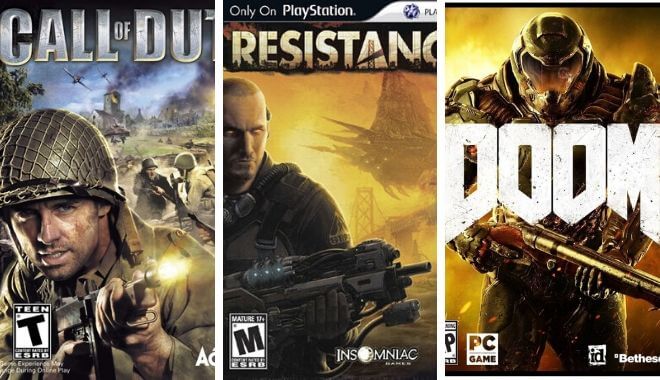
Gun guy is when the gruff hero or heroine is holding their gun on the box art. BioShock, Fallout: New Vegas, Alan Wake: American Nightmare, Resident Evil 4, and the aforementioned Call of Duty all display this.
Head-to-Head
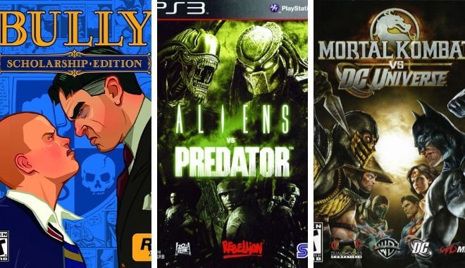
What would a game be if the two most influential characters weren’t facing off in a dramatic pose, face to face? Bully, Mortal Kombat, and more are adherents to this style.
Close up
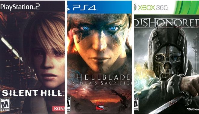
These games cover to display a character’s face right in YOUR face. Both Metal Gear Solid V: Ground Zeroes and The Phantom Pain, along with Metal Gear Solid 4: Guns of the Patriots, are examples from within the same franchise.
Some other good cases are Dead Space 3, God of War III, and Yakuza 3.
Iconic Box Cover Art
Ico (Japanese and European Versions)
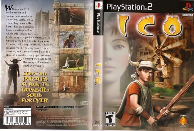
Not only is this game a unique piece of art, but the cover is fantastic. It was inspired by a real piece of art, The Nostalgia of the Infinite by Giorgio de Chirico, and you can see it immediately upon viewing it.
After seeing this, the American cover looks pathetic, stripping away the beautiful artistry and creativity that weaves its way through Ico.
Borderlands
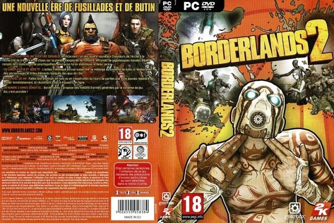
This video game cover art nearly made me buy the game on its own.
Seriously, look at that!
A desert raider has his fingers pointed to his head, blowing his mind and creating a patchwork of scenes from the game. It pins down precisely what the game is like and prepares you for a whole lot of fun looting and collecting.
Ico’s was one of the better covers in recent gaming history. Not only that, but the subsequent games have picked up that significant trend, applying it to their other titles.
Red Dead Redemption
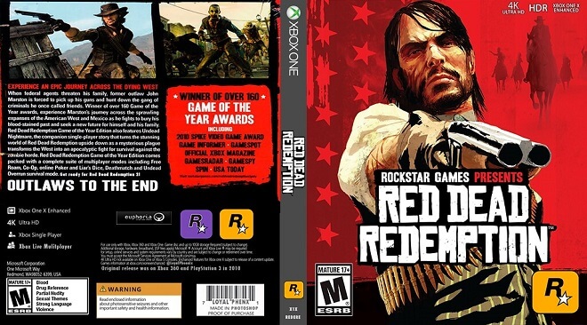
Who can forget the first time they saw the cover of Red Dead Redemption, in which a tired, grizzled John Marston is pointing a sawn-off shotgun toward the viewer? Again, this telegraphs to the prospective gamer precisely what the entire tone of the game will be. It’s blunt, unforgiving, brutal, and a blast.
Heavy Rain
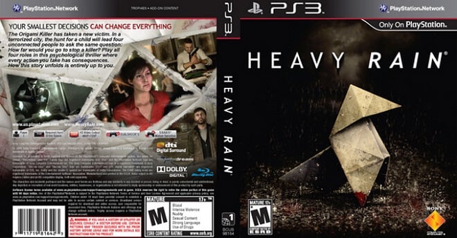
This cover is one of my all-time favorites.
Heavy Rain, the story-based ‘movie-game’ by David Cage and Quantic Dream, displays a shabby origami figure being washed out by a…you guessed it…heavy rain. Heavy Rain’s cover is one of those that tells you all you need to know: it’ll be a depressing, weary story through the darkness of humanity.
In the game, the infamous ‘Origami Killer’ is on the loose, and our protagonists are trying to find out who it is.
Multiple Final Fantasy Games
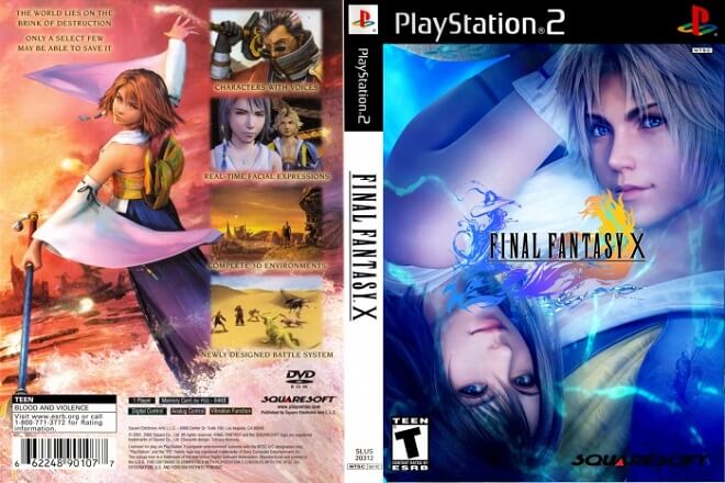
Final Fantasy games tend to make gamers feel a lot of things. Excitement, happiness, sorrow, and fun. But the game art is a real work of beauty.
The logos all share a similar art style, being penned by artist Yoshitaka Amano. The beauty of Amano’s work is stunning and has been featured on all of the Final Fantasy games since Final Fantasy IV. My favorite is Final Fantasy X and Final Fantasy XII.
Conclusion
While there are many other examples of iconic box art, these are some of the best. It is a good sign that video game cover art, despite some clichés and adverse trends, is more or less always consistently good. For every Call for Duty cover, you have an Ico. I’m willing to make that trade every time!
