When we boot up our console or PC game of choice, we are always met by the company’s logo that created them. While this logo screen is merely a pit stop on the way to the main game, this display is crucial for punching a gaming company’s brand and giving credit where credit is due.
I booted up Yakuza O the other day. A bright white screen with the crisp blue ‘SEGA’ logo popped up with a pleasant noise when it started.
How did the company come up with such a short, sweet intro and display? Who made those crisp blue letters?
Let’s take a closer look at video game logos, why they are essential, and which logos are the most iconic in gaming.
What Makes A Good Gaming Logo?
A good gaming logo needs to do a few things. First, it needs to look pleasing to the eye. As you’ll see on our list, some of the biggest companies’ gaming logos are really lovely to look at. A striking contrast, brightness levels, color choice, it all matters.
However, a ‘good’ logo is one of those pesky things that are subjective to the viewer. I might love the Atari logo, but someone else could think it looks underwhelming or boring. That’s what makes creating an effective game logo even more difficult.
Nevertheless, talented designers at ten particular companies, we believe, have transcended the subjective barriers for video game logo design.
Making Your Own Gaming Logo?
We wish we could give you a definitive answer about what makes a video game logo design perfect. It simply doesn’t exist. However, there are some great tips and ideas to consider when designing a logo of your own.
First, you don’t want it to be too ‘busy.’ What we mean by that is you don’t want too much happening with it, distracting the viewer from the overall message. As you’ll see on our list, many of the companies have simple yet elegant and compelling designs that are entirely their own.
Keep it simple. Use the vibe and feel of your company or game to drive the creative force behind designing the logo.
The Fundamentals of Logo Design
People make the logo design look easy. Whether it’s Facebook or Google, it honestly looks like logo design is a piece of cake. However, there are fundamentals nearly everyone must follow to make an effective logo. Let’s look at some of the fundamentals.
- Keep it Simple. No need to get all flashy and distract users from your product or video game
- Color Use. Use the colors of your design to your benefit. You need to be aware of how the consumer will view your logo, if it’s aesthetically pleasing, etc.
- The Rule of Black and White. An ideal logo should be versatile. As such, it should look good if it’s transformed into a black or white design. If it can survive the black and white test, you may have a great video game logo on your hands.
How to Get A Logo
You don’t need to go crazy searching for talented graphic design artists to create a video game logo for you. You also don’t need to spend hours deliberating on what makes a good logo, frankly.
There are plenty of resources out there to help you make a logo right now. Here are some notable ways to make a video game logo.
10 Iconic Gaming Logos
Sony PlayStation
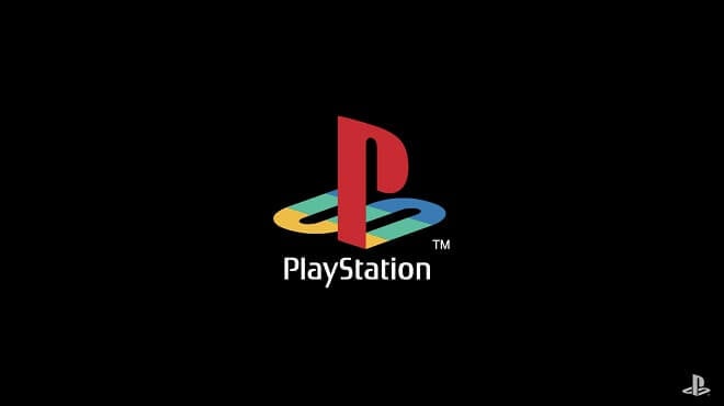
You knew it was coming. This logo by Sony is one of the best video game logos in existence.
Look at the dominant ‘P’ with the subtle ‘S’ right under it. This game logo is both attractive and gets the point across immediately. It’s easily one of the most recognizable gaming logos on the market. It works as both a symbol and as letters, a fantastic combo.
Sega
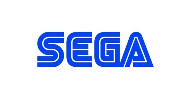
Look at that! For decades, this iconic logo from Sega has been, quite literally, at the forefront of gaming.
Sega has been around since the 1940s. Since then, its logo has stayed relatively the same, barring a few minor tweaks. Sega had a lot of fun with its logo, incorporating it into its stable of games like those in the Sonic franchise, Altered Beast, Shenmue, Yakuza, and ClayFighter.
When you saw the Sega logo, you knew you were in for a ride.
EA – Electronic Arts
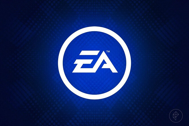
Okay, so EA hasn’t exactly been in the good graces of gamers lately, but it doesn’t mean its logo is totally killer. This logo, a simple ‘EA’ with some embellishments, communicates that yes, this is, in fact, an Electronic Arts game.
Those of you who played sports games will likely remember EA’s catchphrase, “EA Sports – It’s In the Game.” This not only made the logo and company famous, but it made the EA logo a substantial part of the game.
Now that’s successfully pushing a brand.
Rockstar
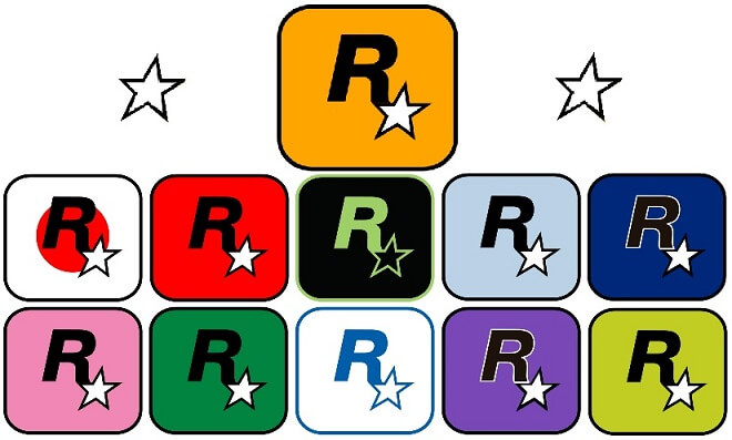
I love this one. Rockstar, the developers of games like Max Payne and Grand Theft Auto not only know how to make a great action game, but the company is also great at making a killer logo. It’s simple, recognizable, and tells the gamer precisely what they’re getting: a great Rockstar game.
Surrounded by a yellow background, a stark ‘R’ with a star on the lower right side of the letter somehow ‘pops’ with its simplicity. There are also pretty cool variants, depending on where the company’s office is. For example, Rockstar North, based in the UK, has a blue logo.
Zynga
Back in the day, you may have received a pesky invite from your aunt on Facebook for games like FarmVille. Sure, it was annoying, but the company who created it, while creating addictive games, creating a great logo.
With a striking red background, the company’s name and a white silhouette of a dog make Zynga’s logo stand out. Word with Friends, Mafia Wars, FarmVille. These massively popular games compose Zynga’s roster of games and make Zynga one of the world’s most profitable companies.
Valve
Valve has a fantastic logo. Straightforward, practical, and no flashy nonsense.
Gabe Newell’s company capitalizes on simplicity, as well as making it unique. The smaller ‘E’ on the end makes it stand out as the quintessential logo for Valve and signals to gamers that Valve’s unique games are right around the corner.
Naughty Dog
From the company that brought us the Uncharted series and The Last of Us comes this sick logo.
With a red paw print separating the words, this is an extremely practical design that is entirely no-nonsense and communicates the kind of vibe that the games Naughty Dog releases are so well known for. Whether it’s Crash Bandicoot or Jak & Daxter, Naughty Dog premises adventure with its logo.
Atari
Come on. You knew Atari was going to make the list.
Atari has had that fantastic font, along with the three bars on top, forever. One of the first major game companies, Atari’s logo has become synonymous with gaming itself, representing fun, creativity, and immersion in all of its titles.
This is just one of the few variants.
Skyrim
Okay, so this may not be a company logo, but it’s powerful enough on its own to command a spot on the list.
The Skyrim logo, a beautiful yet straightforward dragon design, communicates the majesty, action, adventure, and intrigue that you will encounter while playing the game. This logo is intimately connected with the lore of the game. Technically, this is called ‘The Seal of Akatosh”, one of the nine divines in the game.
If you have played Skyrim, you’ll immediately recognize the significance Akatosh plays in the story, as well as the impact on the in-game world of Tamriel.
Nintendo
Where would we be without Nintendo and Shigeru Miyamoto?
With its logo, Nintendo, much like its games, communicates a simple, yet creative logo. White text on a striking red background creates a vivid yet welcoming site, something that is integral in Nintendo games.
Conclusion
Game company logos have been an integral part of gaming. It opens the game you play and communicates messages to gamers.
What is your favorite game company logo? Is it PlayStation? Maybe Electronic Arts?
While logo design (and design in general) is entirely objective, I think we can all agree that video game logos in general, kick-ass and represent fantastic worlds, characters, graphics, gameplay mechanics, and stories.
