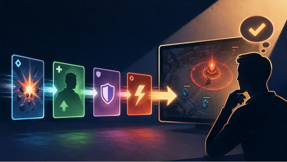
A fast interface can fail even when every individual element is legible. The trouble begins when several correct signals arrive together: a score changes, a resource falls, an objective opens, and a warning appears before the player has connected any of them. Readability therefore depends on continuity. The player needs to see what happened, understand which system value changed, recognize the cue that represents it, and know whether the next decision is different.
A PLOS One study of League of Legends players provides a useful example. In a moderate task, 11 expert participants showed wider gaze distribution and shorter fixation duration than 9 lower-skill participants. The study shows that demanding play may require information to be gathered across several screen regions within very little time, which makes the relationship between cues as important as the clarity of each cue.
Follow the Change Through Four Layers
Fast-moving interfaces are easier to assess when each update is treated as part of a connected sequence rather than as an isolated visual element. A cue may be clear on its own and still fail if the player cannot relate it to the event that caused it, the system state it changed, or the decision that follows. The designer’s task is therefore to preserve continuity from action to consequence. Following one event through each stage reveals exactly where that continuity weakens.
A practical review can trace one event through four layers: the source event, the changed system variable, the player-facing cue, and the newly available or altered decision. Consider a basketball possession that ends with a turnover and an immediate counterattack. The event is visible on the court, while the digital system may also update possession, time remaining, and derived values.
For a viewer following the game during a live session at Lucky Rebel, those changes can arrive within seconds, but the design question is still whether the viewer can connect cause and consequence before the next event. If a revised figure appears before the turnover’s significance is clear, the interface presents an answer without showing the reasoning. Later in the same Lucky Rebel session, another possession may produce a similar visual burst while changing a different variable, so the cue must indicate what moved rather than merely announce that something happened. The same trace works for a combat HUD, racing display, or strategy panel because it follows the information, not the genre.
The distinction becomes clearer when raw events and interpreted measures appear together. A discussion of live, in-game sports information mentions examples such as turnovers, shot quality, first-serve percentage, unforced errors, pace, and expected goals. For interface analysis, the useful role is classification rather than prediction. A turnover is an event. Possession is a state. Turnover rate is a derived measure. A designer must decide which level matters now, which can wait, and whether the displayed cue changes the user’s next decision.
Find the Point Where Continuity Breaks
The first failure occurs when the event is obvious, but its meaning is unclear. A player sees an enemy glow, hears a warning, or watches a number fall without knowing whether the change affects damage, movement, defense, or turn order. The cue attracts attention but does not complete the thought. A stronger design connects the event to the affected value through position, motion, wording, or a brief visual relationship. The player should not need to review another corner of the screen to reconstruct what changed.
The second failure reverses the problem: the consequence appears without its cause. A timer shortens or an indicator changes color after the relevant action has already disappeared. The third failure is competition. Several cues may all be accurate while being collectively unreadable because they demand the same moment of attention. Designers can reduce that conflict by asking which change alters the next action. That cue receives immediate emphasis, while secondary information remains available without interrupting the decision.
Give Every Cue a Specific Job
Priority should follow the next decision rather than visual drama. A large animation may suit a decisive objective change, while a small positional shift may be enough for a secondary statistic. Persistent values should stay stable enough to scan. Temporary alerts should disappear only after completing their explanatory job. When color carries a warning, shape, position, or text should reinforce it, so meaning does not depend on color alone.
A 2025 Smashing Magazine analysis of real-time dashboard design makes a related distinction: hierarchy, grouping, color, and restrained motion should be determined by what the user needs to decide at that moment. Rapidly changing displays can become difficult to follow when updates lack context or several alerts compete for attention. A game HUD is not an operational dashboard, but the same design test applies. Every prominent cue should help the player identify the current state or recognize the next relevant action. Information that requires slower interpretation can remain available without competing with an immediate warning.
Test One Event Before Testing the Whole HUD
Pause a prototype immediately after one meaningful event and ask four questions. What caused the change? Which system value moved? Which cue communicated it? What decision is now available, altered, or no longer relevant? If any answer requires guessing, the chain is broken.
The fix may involve stronger hierarchy, but it may also require better timing, clearer grouping, or the removal of a redundant alert. Repeat the test at normal speed, then with several events close together. A cue that works alone may disappear inside a crowded sequence. Readability is achieved when cause leads into state, state leads into a cue, and the cue reaches the player before the next important decision begins. That sequence is the real test of fast-changing game-state readability.

